27th February 2024
How to get creative with your Shine entries
Hello everyone,
One of my ambitions as Chair of the Shine Awards is to visit schools and find out how students put together their projects, the challenges they face – and how we can help.
With this in mind, in January I accepted an invitation from Antony Barton, the Head of English at Putney High, in west London. Putney’s school magazine, ‘A Study in Purple’, has been a consistent entrant in the Shine Awards and the team behind the project wanted to talk about a subject dear to my heart: design.
As Chair, fairness is something that’s really important to me. So, just as we published Liz Hunt’s top tips for great journalism a few weeks ago, so I’ve written up the central points I made to the team at Putney High for all Shine Award entrants in the hope this is useful and inspires great design in magazine (print or e-publication) or newspaper entries.
So, without further ado, here are my top ten tips for designing a great student magazine:
- Know your audience, understand their world
For the purposes of this, I am assuming the audience are your fellow students, but we have many entries that are themed, for instance around science. Equally your project may be for the local community. Remember to think about this, the age-sweep of the readership and the sort of publications they enjoy. Can yours compete or go one better? - Do your research
Go to a good newsagent and pick out a series of magazines you love the look of and get inspired. Understand the context of each publication and how the designers behind it have made the most of the journalism to make it as readable – or as wildly creative – as they can. For school newspapers and magazines a good idea would be to start with magazines that are designed for that age group. It might mean you learn something by analysing what they have done and figuring out what you like – and what you don’t – from their layouts. - The order and mix
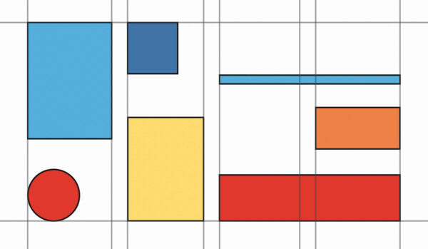
We often speak about the mix of content in a publication. Essentially it’s the rise and fall as a reader flicks through the pages (printed or digital). But what about the feel of the design? The front pages might be newsy, detailed and tightly-packed, then as you continue the layouts can feel more spacious, expansive, giving way to large photographs and a more playful use of large typography for headlines. The key thing is that the project feels like one coherent whole, but variety and pace are always good to consider, beginning to end.. - Are you on the grid?
It’s worth doing a bit of research on how a page grid works. Essentially the grid encompasses the margins and columns of each page, allowing you structure and freedom to design in a way that feels consistent and adds a visual cleanliness to your design. The most obvious use of a grid layout is on a newspaper and it’s worth observing how a daily paper both packs content in – and lets it breathe. - What does type mean to you?
Every designer worth their salt has a favourite typeface – but what you like may not always be the right choice for your school media project. Do some research around free typefaces from Google Fonts, for instance, which has hundreds of options. But don’t get overwhelmed by the choice: simplicity and style always win out, even when you’re designing for teenagers! One great tip is to pick a typeface which has many weights, bold to ultra-light, meaning you have options: consistency and flexibility. - Some of the best parts of your publication are blank
Designers often talk about the use of ‘white space’, but what does that mean in reality? Essentially, if you cram every square centimere of the page with type, colour and image looking at a page can be seriously offputting. Leaving a column of text blank, or having a short ‘pullquote’ from your article could be a way of letting the page breathe, meaning it immediately feels more appealing. Equally a large, beautiful headline ‘leading the page’ with nothing around it is another great way of drawing in a reader and letting them know where to begin reading. - Be confident designing without visuals
We understand that for privacy reasons, having photographs of your fellow students isn’t possible for schools. Given people shots are usually the most engaging, if you’re designing a media project without such (or any) photos, what can you do? One way is to take a look at publications like TIME magazine or The Economist which often have to make a headline do all the work. As ever, seek inspiration from the experts who already solved these problems then find your own approach within the design style you’ve chosen. - Snap!
That being said, your fellow students don’t need to be present to make a great photograph, and even anonymised people or silhouettes can make for a powerful visual image that can tell a great story. Having a stunning photo that is included for artistic rather than purely storytelling reasons is a totally viable choice and strongly recommended. One of our award categories focusses on this alone. Find out which of your fellow students is a budding photographer and see if they can find a way of interpreting an article in a creative, fresh way. - Commission great art
Another really strong idea to increase visual appeal is the use of illustration or cartoons. If you know one of your team is writing an article on a specific topic, why not get someone at school who’s a strong artist to draw something that will work alongside it? To go one step further, if one of your contemporaries is a great and witty illustrator why not create a strong and amusing cartoon? Again, we have a specific award for both illustration and cartoons and they are often overlooked. Your first Shine Award could win by entering a category that other schools didn’t think of. The message here is: get more people involved! - To print… and on what?
We understand that printing is expensive, which is why many schools opt for a digital entry. That’s totally understandable and every bit as likely to win a design prize. However if you are going to print, a first step is to consider a sponsor who can cover this cost, or a printer who might produce the magazine in exchange for an advert, The next step is to decide what paper you want the project printed on. Then, shouldn’t you consider recycled or sustainable stocks? Two more categories come to mind here – ‘Best print’ and ‘Best sustainability initiative’. By making good choices here, you can put yourself in the running on two separate, further Shine awards…
I hope these are helpful – and don’t forget, the Shine website has a load more advice for students in our ‘guidance’ section, here.
I’d also like to visit more schools, my work commitments allowing. So if you are a head of English and think your students could benefit from a design masterclass, get in touch.
As ever, to register for the Shine School Media Awards 2024, just drop us a line at shine@stationers.org
Til next time,
Richard
Chair of Shine